Dragon Pearl Ltd.

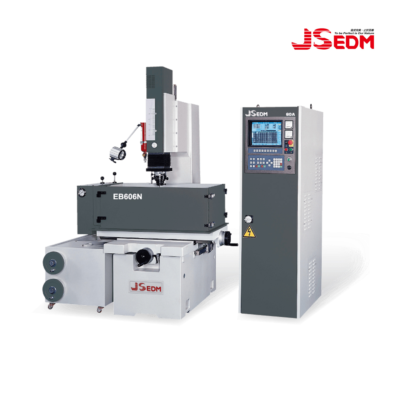
Capacity of work tank 1100X600X400mm
Work table size 700X400mm
Longitudinal travel (X-axis) 400mm
Cross travel (Y–axis) 300mm
Z axis travel (Z-axis+W-axis) 180+250mm
Distance between platen to table 210~640mm
Max. Electrode weight 100kgs
Max. Work piece weight 1500kgs
Fluid tank capacity 350L
Machine outside dimensions (WXDXH) 2500X1500X2250mm
Machine weight 1800kgs
Max. Machining Current 60A 90A(Optional)
Max. Power input 7KVA 10KVA
Max. Machining rate(mm/min 400 600
Min. Electrode wear ratio 0.15%
Best surface / Ra Ra 0.2µm
Min. D.R.O. resolution (mm) 0.005mm

It's easy to get started creating your website. Knowing some of the basics will help.

What is a Content Management System?

A content management system is software that allows you to create and manage webpages easily by separating the creation of your content from the mechanics required to present it on the web.

In this site, the content is stored in a database. The look and feel are created by a template. Joomla! brings together the template and your content to create web pages.

Logging in

To login to your site use the user name and password that were created as part of the installation process. Once logged-in you will be able to create and edit articles and modify some settings.

Creating an article

Once you are logged-in, a new menu will be visible. To create a new article, click on the "Submit Article" link on that menu.

The new article interface gives you a lot of options, but all you need to do is add a title and put something in the content area. To make it easy to find, set the state to published.

You can edit an existing article by clicking on the edit icon (this only displays to users who have the right to edit).

Template, site settings, and modules

The look and feel of your site is controlled by a template. You can change the site name, background colour, highlights colour and more by editing the template settings. Click the "Template Settings" in the user menu.

The boxes around the main content of the site are called modules. You can modify modules on the current page by moving your cursor to the module and clicking the edit link. Always be sure to save and close any module you edit.

You can change some site settings such as the site name and description by clicking on the "Site Settings" link.

More advanced options for templates, site settings, modules, and more are available in the site administrator.

Site and Administrator

Your site actually has two separate sites. The site (also called the front end) is what visitors to your site will see. The administrator (also called the back end) is only used by people managing your site. You can access the administrator by clicking the "Site Administrator" link on the "User Menu" menu (visible once you login) or by adding /administrator to the end of your domain name. The same user name and password are used for both sites.

Learn more

There is much more to learn about how to use Joomla! to create the website you envision. You can learn much more at the Joomla! documentation site and on the Joomla! forums.

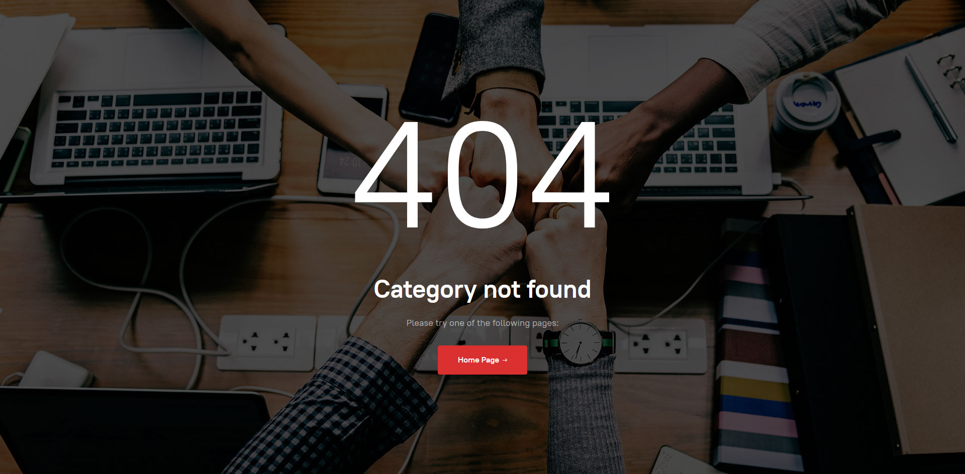
Each JA Joomla Template has its own matching 404 page. Below is the screenshot of 404 page style.


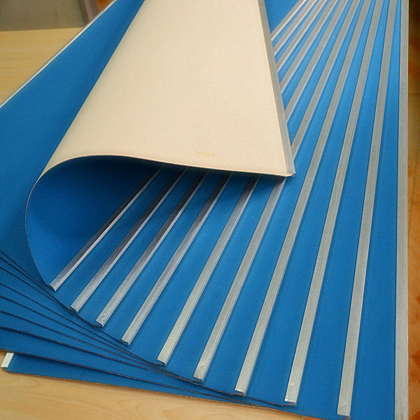
All Types of offset Printing Rubber blanket :

1 . CONVENTIONAL / COMPRESSIBLE / INK PRINTING BLANKETS

2 . UV PRINTING BLANKETS

3 . HYBRID / COMBI BLANKETS

4 . VARNISH / UV COATING BLANKETS

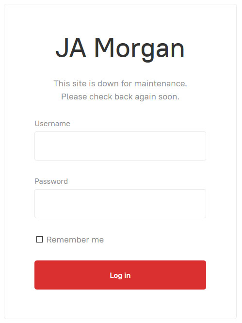
Each JA Joomla Template has its own matching Offline page. Below is the screenshot of Offline page style.


Heading Text

h1. Heading Secondary text

h2. Heading Secondary text

h3. Heading Secondary text

h4. Heading Secondary text

h5. Heading Secondary text
h6. Heading Secondary text

TIPS: Create lighter, secondary text in any heading with a generic <small> tag or the .small class.

Example body text

This is a lead paragraph.
Make a paragraph stand out by adding .lead.

Maecenas sed diam eget risus varius blandit sit amet non magna. Donec id elit non mi porta gravida at eget metus.

Nullam quis risus eget urna mollis ornare vel eu leo. Cum sociis natoque penatibus et magnis dis parturient montes, nascetur ridiculus mus. Nullam id dolor id nibh ultricies vehicula.

The following snippet of text is rendered as bold text.

The following snippet of text is rendered as italicized text.

An abbreviation of the word attribute is attr.


Address

Company Name
795 Folsom Ave, Suite 600
San Francisco, CA 94107
P: (123) 456-7890
Full Name
P: (123) 456-7890
This email address is being protected from spambots. You need JavaScript enabled to view it.

Emphasis classes

This is a .mute paragraph.

This is a .text-primary paragraph.

This is a .text-warning paragraph.

This is a .text-danger paragraph.

This is a .text-success paragraph.

This is a .text-info paragraph.

Alignment classes

This is a left aligned text .text-left

This is a center aligned text .text-center

This is a right aligned text .text-right

This is a justify aligned text which is often used in Book Design, Magazine or special Typo Pages. Create a justify aligned text with .text-justify class.


Blockquotes

Lorem ipsum dolor sit amet, consectetur adipiscing elit. Integer posuere erat a ante.

Quote's author in Source Title


Color Swatches

Brand Colors

#d93030
Brand Primary
#1b3060
Brand Secondary
#f0ad4e
Brand Warning
#d9534f
Brand Danger
#5bc0de
Brand Info
#5cb85c
Brand Success


Grayscale Levels

#222
Gray Darker
#333
Gray Dark
#555
Gray
#999
Gray Light
#eee
Gray Lighter
#f2f3f7
Gray Lightest


Navigations

Tabs

In the area of graphical user interfaces (GUI), a tabbed document interface (TDI) or a Tab is one that allows multiple documents to be contained within a single window, using tabs as a navigational widget for switching between sets of documents. It is an interface style most commonly associated with web browsers, web applications, text editors, and preference panes.

GUI tabs are modeled after traditional card tabs inserted in paper files or card indexes (in keeping with the desktop metaphor).


Inputs


Indicators

Alerts and Notifications

Error message title

Cras ac dignissim mauris. Duis odio diam, rutrum ut est at, scelerisque malesuada risus.

Sussess message title

Cras ac dignissim mauris. Duis odio diam, rutrum ut est at, scelerisque malesuada risus.

Info message title

Cras ac dignissim mauris. Duis odio diam, rutrum ut est at, scelerisque malesuada risus.

Warning message title

Cras ac dignissim mauris. Duis odio diam, rutrum ut est at, scelerisque malesuada risus.


Labels

Default Primary Success Info Warning Danger


Misc

List groups

  • 14 Cras justo odio
  • 2 Dapibus ac facilisis in
  • Morbi leo risus
  • 1 Morbi leo risus
  • 2 Dapibus ac facilisis in

List group item heading

Donec id elit non mi porta gravida at eget metus risus varius blandit.

List group item heading

Donec id elit non mi porta gravida at eget metus.

List group item heading

Donec id elit non mi porta gravida at eget metus.


Panels

Panel heading

Panel content

Panel primary

Panel content

Panel success

Panel content

Panel warning

Panel content

Panel danger

Panel content

Panel info

Panel content


Wells

Look, I'm in a small well!
Look, I'm in a well!
Look, I'm in a large well!
Page 1 of 2